Why Site Aesthetics Matter for Small Business Owners
If your content and products are great, does it matter how your website looks? Site aesthetics are a crucial part of the customer journey; they project an image of your brand, keep people engaged, and have many other tangible benefits. In the second of this three-part series, we examine why site aesthetics matter for your website and what you can do to improve them.
Design creatively isn’t a skill that everyone has but you don’t need to be the next Picasso to have an exciting, engaging, and professional website. Break down site aesthetics into smaller areas and embrace simple techniques to keep people reading your site or completing their checkout.
Related content:
Why site usability matters for small business owners
What is site aesthetics?
Site aesthetics is everything related to the visual appearance of your website. It includes the layout of the information, the menu system, imagery, colours, fonts etc. When combined, these aspects function as a reflection of your brand. If you can create an aesthetic that flows throughout the site and is user-friendly, it can be the difference-maker for your conversion rates.
What are the consequences for a small business?
If you have poor site aesthetics, your users will feel repelled, and many will leave your site searching for alternatives. Some will be aware that they clicked out because they found the design jarring or hard to use; others will be unaware but just not feel convinced by your offering. Your website is an extension of your brand – its aesthetics portray your level of professionalism and create a user experience that can help or hinder people’s interest in your product or service.
A bit of science
This is an extract from a government report on the effect of site aesthetics:
“The design and presentation of a Web site is strongly visual and users are known to make aesthetic judgments of a site very quickly. As the Web site likeability and credibility increases so does the likelihood of purchasing from the site. Since the site’s aesthetics can influence brand perception and credibility, the importance of design and color treatments must be considered.”
What can I do about site aesthetics?
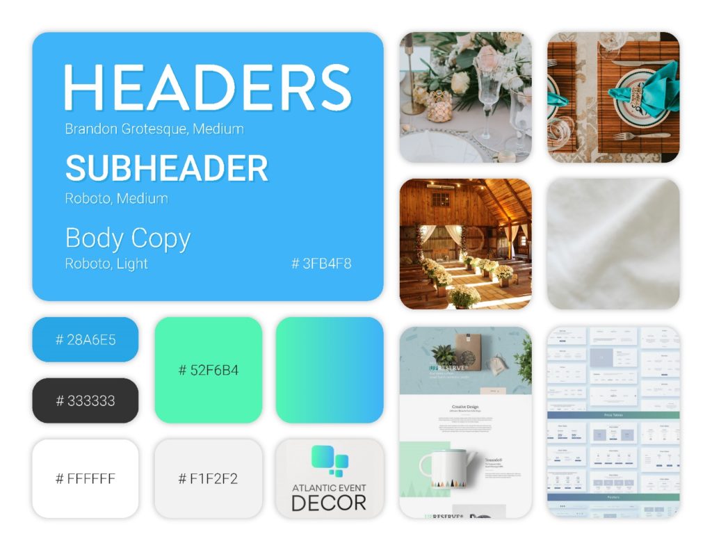
The specific choices you make should reflect your current branding. Try to mirror your existing colour schemes and font choices. If you don’t have a colour palette or uniform fonts, we strongly suggest you get our designer to create a mood board for your business. A mood board is your reference document to ensure your brand has a uniform and aesthetically pleasing presence.

Example of a mood board we created for a client.
Once you have your colours, fonts, and general aesthetic, here are some tips to help you on your way:
- Choose two or three fonts and stick to them! Do not be tempted to use different fonts to break up sections of text. It is hard to read, tiring for the reader, and there are better ways to create separation.
- Balance your white space. This one is so important and will take some playing around to see what works and “feels” right for the reader. A crowded site can look overwhelming and cheap. By adding in small sections of white space, you allow your site to breathe and elevate its look too! On the other hand, if you have large sections of blank space, it can cause people to scroll and/or lose interest.
- People prefer websites that are intuitive and flow smoothly. Consistent colours and fonts help create this environment, so stick to your mood board.
- Break up large sections of text with infographics or photos. Photos could be in-house or you can use stock imagery to convey information and excitement non-verbally.
- Consider adding video or musical aspects to your site. Pro-tip for music: don’t let music autoplay as people dislike a sudden and unexpected intrusion of music when they surf. Pro-tip for video: a silent video that autoplays on a home page can be remarkably effective. If you dabble with either of these aspects to improve your site aesthetics, make sure you balance it with the needs for your site’s usability. Too many assets can slow your page’s load speed and cause potential customers to flee.
How to test your site aesthetics
Just like your site usability, you are unlikely to be able to be objective about your website’s aesthetics. Ask a neutral party for their honest opinion or add a survey pop-up to your website to gauge the opinion of those who visit your site. You may want to ask:
- What were their first impressions when they landed on the website?
- Did they feel the whole website had a cohesive look?
- Were there any elements they found off-putting?
- Did they like the colour scheme?
- Did they feel there was the right balance between text and media assets?
Need a hand?
If you are looking for a mood board, advice on your site aesthetics, or want to talk about any other aspect of your website design, we’re only a click away. Get in touch and let’s start supercharging your website today!
Cyber PR Army Solutions Inc.. Understand where you want to be, and we’ll help you get there.
