
How to confidently choose your brand colours
Updated 17 August 2025.
Brand colours are an essential element of a strong brand identity for your small business and a handy shortcut to create consistent content across all aspects of your online and offline presence. Put some time aside to nail this at the start. It will pay off and help you build a recognizable and attractive brand.
Colour choices can make a big impact on consumer perception and brand recognition. It’s why mega-brands, such as Google, Facebook, and McDonald’s, spend millions of dollars perfecting that perfect shade. We often don’t notice the changes consciously, but rigorous testing means that the corporations know what to use and how it influences us.
Facebook’s logo changes over time. Meta
While no small business pours that much time or money into testing and adjustments, your choice of brand colour can and will make a difference.
Why Brand Colours Matter
Colour is one of the most powerful tools in branding. Up to 80% of snap judgments about products are based on colour alone, and consistent use of brand colours can increase brand recognition by as much as 80%.
Think of the golden arches of McDonald’s or the iconic red of Coca-Cola. These colours are instantly recognizable and evoke specific emotions and associations. Your brand colours do more than make things look pretty. They:
- Establish brand identity and recognition
- Evoke emotions and associations
- Increase recall and trust
- Create a competitive edge in crowded markets
Understanding Brand Colour Palettes
A brand colour palette is a carefully selected set of colours used consistently across all brand materials: logos, websites, packaging, social media, and more. A typical palette includes:
- Primary Colour(s): The main colour(s) that represent your brand and are used most frequently.
- Secondary Colours: Complementary colours that add variety and flexibility.
- Accent Colours: Used sparingly to highlight specific elements or calls to action.
- Neutral Colours: Backgrounds, text, and supporting elements (think whites, greys, and soft tones)
The Psychology of Colours
As you know, different colours evoke specific emotions that are generally similar across the country. When you choose your brand colours, you should lean into this, while avoiding clashes with other elements that are core to your brand.
Here are some examples:
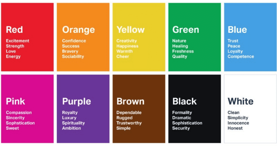
Website user colour associations. UserTesting
- Coca-Cola uses red in its logo and packaging to create a sense of energy, excitement, and passion.
- Facebook incorporates blue in its logo and interface as it is often associated with trust, reliability, and professionalism, which aligns with Facebook’s goal of creating a safe and trustworthy online platform.
- McDonald’s uses a colour combination of red and yellow in its logo and restaurant design. Red stimulates appetite and creates a sense of urgency, while yellow evokes happiness and optimism. This powerful combination attracts attention and creates excitement for consumption.
Know Your Brand’s Personality and Values
Of course, your business is unique. Small businesses have more personality, nuance and potential to showcase their individuality. You can incorporate aspects of your business’s personality into your brand colour choices.
Start by thinking of your business as a person. If you’re a solopreneur, this is relatively simple, as your business is an extension of you. Even if you are a small team, you can think about the core values and communication tone that you have or would like to have if you’re just getting started.
Is your business playful? Serious? Peaceful? Vibrant?
Break it down into traits, then think about the colours you associate with them.
Consider Your Target Audience
How you see your business and how your audience sees your business should align, so think about what they are looking for in your branding, too. If you are marketing to middle-aged men, it doesn’t matter how vibrant and feminine you are; they are unlikely to love a hot pink brand palette!
Think about the demographics of your audience, both now and who you would like to be your customers. Are they young? If so, think bright colours. Are they traditional? Monochrome could work well. Are they predominantly male or female? How can you incorporate this into your thinking?
If you’re not sure what your audience likes, ask them! Polling your audience on their preferred colour or colour scheme helps them feel included in your decision-making, bringing them closer to your brand.
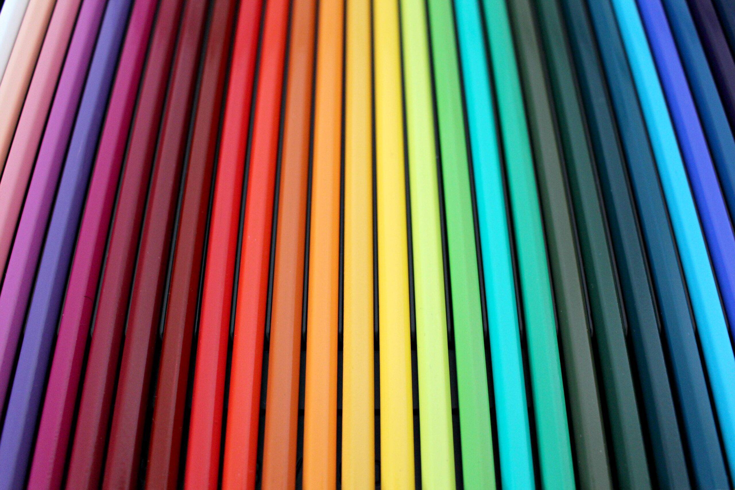
How Many Colours Should a Brand Have?
There’s no one-size-fits-all answer, but most successful brands use:
- 1–2 primary colours for recognition
- 2–4 secondary or accent colours for flexibility and depth
- Neutral tones for backgrounds and text
Too few colours can limit your creative options, while too many can dilute your brand’s impact. The key is balance and consistency.
How to Choose Your Brand Colours: Step-by-Step
1. Define Your Brand Personality and Values
Ask yourself:
- What is your brand’s mission and vision?
- What emotions do you want to evoke?
- Who is your target audience?
- What makes you different from competitors?
2. Research Colour Psychology
Learn how different colours influence perception and behaviour. Consider cultural differences and industry norms.
3. Pick Your Primary Colour
Choose a hue that best represents your brand’s core personality and resonates with your audience.
4. Select Secondary and Accent Colours
Add 2–4 complementary colours to support your primary colour. Use these for backgrounds, highlights, and variety.
5. Choose Neutral Colours
Select light and dark neutrals for backgrounds, text, and subtle design elements. Avoid harsh pure black or white for digital use. Opt for softer variations for better readability.
6. Test Across Platforms
Preview your palette on your website, social media, print materials, and packaging to ensure consistency and accessibility. Use tools like contrast checkers to make sure your colours are readable for everyone.
Maintain Consistency Across Platforms
Marketing thrives on consistency. Once you have locked in your brand colours, use them across all platforms. That’s not to say you can never change it again (that’s what a brand refresh is for!), but keeping it consistent everywhere people will find your brand will help them know they are in the right place.
We recommend creating a brand moodboard, even if you are a solopreneur, which is an easily accessible record of your font choices, brand colour palette and some related imagery to convey the feel of the business.
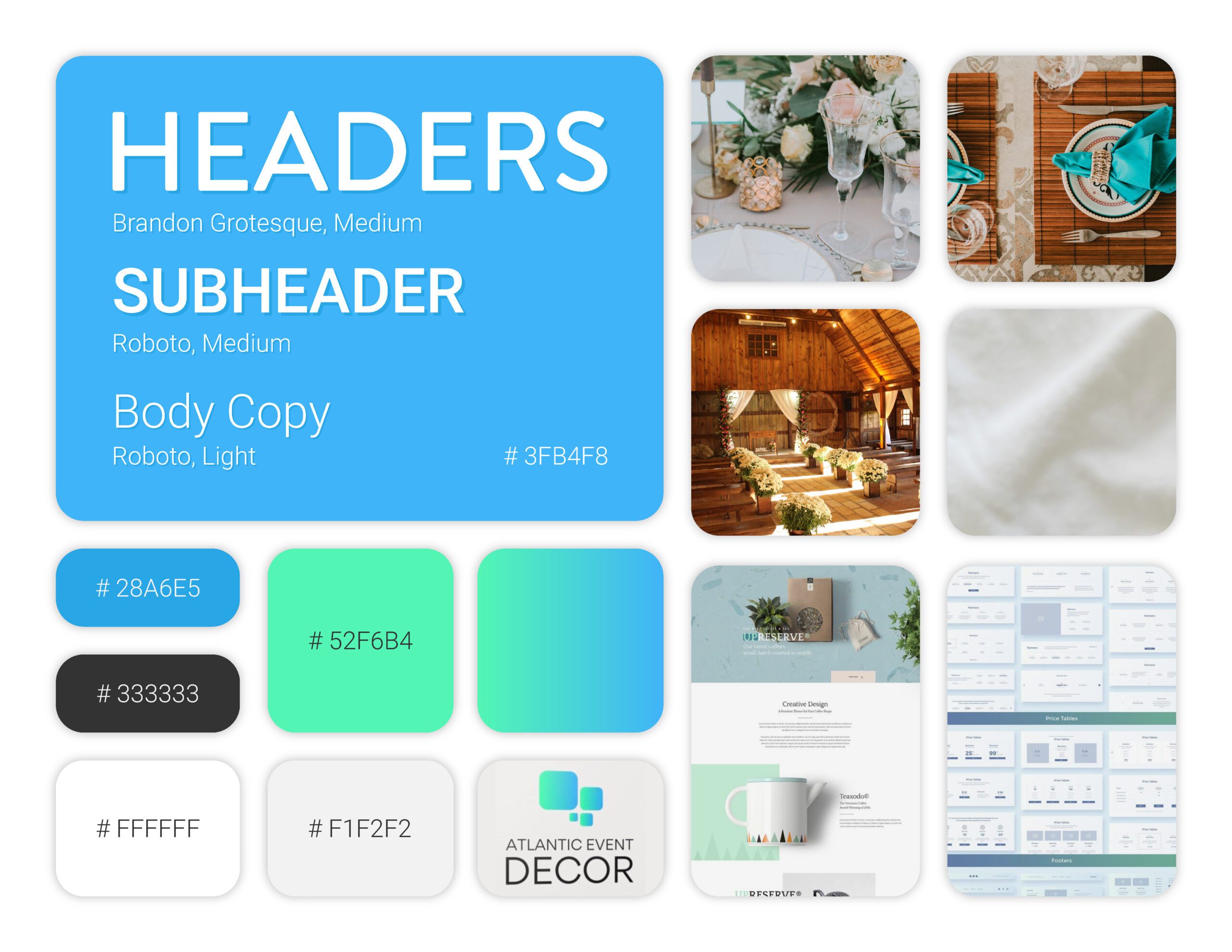
A moodboard for Atlantic Event Decor created by our Designer.
This document will serve as a reference tool for you and your team as your business grows.
Choose with Confidence and Have Fun!
Your brand colours should make you smile. They should capture your business at its essence and feel right to you and your team. Embrace the power of colour to build a strong brand, and know that as a small business, you have the freedom to choose. Your brand will inevitably evolve (and that’s a great thing!), but choosing something you love right now will ensure a level of futureproofing.
Choosing the right brand colours is a strategic decision that can set you apart and make your business unforgettable. Need help developing your brand palette or creating a style guide? Click here to book a free chat with us. We’ll help you drill down to your business’s core values and create a moodboard for you that you can use moving forward.
Cyber PR Army Solutions Inc. Digital Marketing Made Easy.